

How to Design a Shopify Website in 2026 (And When to Hire Someone Instead)

Designing a Shopify website in 2026 is not the same as it was five years ago. The platform has matured, customer expectations have risen, and the gap between a store that converts and one that does not has widened considerably. This guide covers what designing a Shopify website actually involves, the decisions that matter most, and when it makes sense to bring in a specialist rather than doing it yourself.
Introduction
I have been designing Shopify stores as a Shopify Expert for over six years. Before that, I spent 20 years in design across agencies and direct client work, including brands like Dyson and Wrangler. Over time, I have seen the same pattern repeat: brands invest in building a store but underinvest in designing it. They end up with something that looks reasonable but does not perform.
Good Shopify design is not about aesthetics. It is about clarity, trust, and reducing the friction between someone landing on your store and completing a purchase. This guide will walk you through the key stages of designing a Shopify store in 2026, from strategy to launch.
1. Start With Strategy, Not a Theme
Most people start designing a Shopify store by picking a theme. That is the wrong place to start.
Before you open the theme store, you need to understand three things: who your customer is, what they need to feel confident enough to buy, and where your current store (if you have one) is losing them.
This is the foundation of everything else. If you do not know whether your customers are primarily mobile shoppers who buy quickly on impulse, or desktop researchers who compare products for days, you cannot make sensible decisions about navigation, product page structure, or checkout flow.
For new stores, this means doing the thinking upfront. Who are your competitors? What do their stores do well? Where is the gap? For existing stores, Google Analytics and tools like Hotjar will show you where people are dropping off. That data is worth far more than any aesthetic inspiration board.
I spend time on this before every project. The UX review I do at the start of a project is what makes the rest of the design process purposeful rather than decorative. If you want to see how this approach plays out in practice, take a look at some of my Shopify case studies.
2. Theme or Bespoke? How to Make the Right Call
Shopify’s theme store has improved significantly. There are now well-built themes at various price points, and Shopify’s own free theme, Dawn, is a solid starting point. Premium paid themes like Impulse, Motion, and Prestige can look excellent with a good eye and thoughtful setup.
The honest answer is that themes are brilliant for the right situation, and a real constraint in others. The decision should be based on where you are in your business, not just budget.
When a theme is the right choice
If you are launching a new store or testing a new concept, a premium theme is often exactly the right call. You do not yet have the data to justify the investment in bespoke design, and a well-chosen theme with strong visual instincts can look and perform well. Get the store live, start collecting data on how your customers actually behave, and build from there. Spending significant money on a bespoke build before you understand your customers’ purchase journey is putting the cart before the horse.
Themes also work well when your product range is focused, your brand is relatively straightforward to express within standard Shopify sections, or budget is a genuine constraint right now.
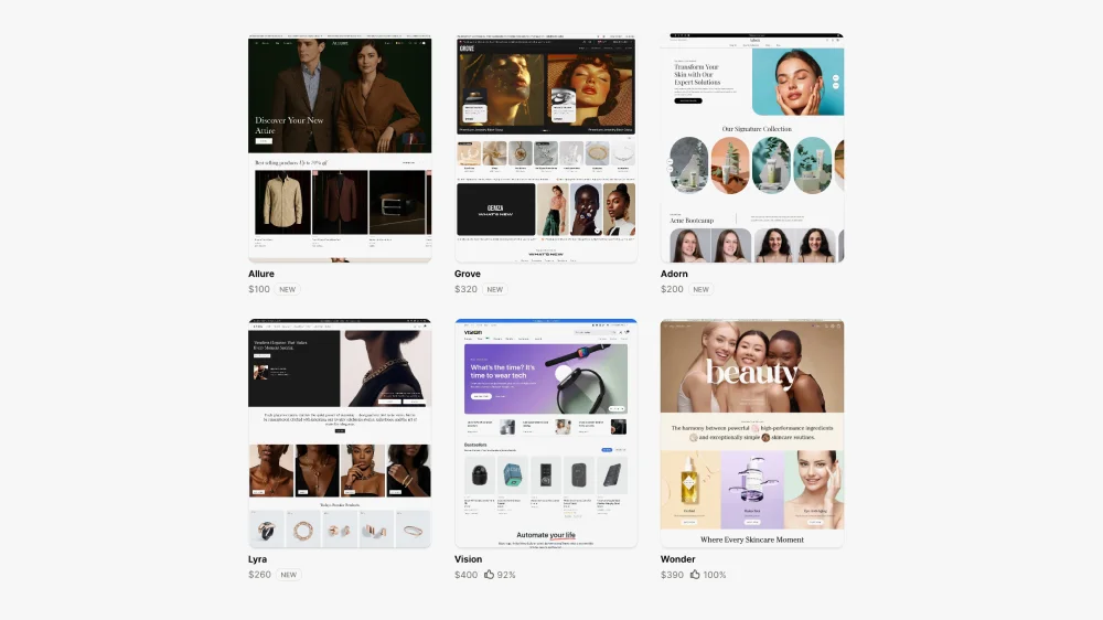
Premium Shopify themes from Shopifys theme store. These all look great with the dummy content, but will they hold up for the unique products?
When bespoke design is worth the investment
The point at which bespoke design pays for itself is when you have real data to work with. Once you know whether customers are using search, which collections they navigate to, where they drop off, and how they move through the purchase journey, you can make genuinely informed design decisions rather than educated guesses.
That data changes everything. If your analytics show that a significant portion of customers use the search bar, a bespoke build lets you design the entire search experience properly — how results are displayed, how products are grouped, how suggested searches are served. A theme gives you a search bar. A bespoke build lets you design a search journey.
The same applies to the purchase journey as a whole. How a customer adds a product to basket, how related products are surfaced, how upsells are introduced — all of this varies enormously depending on your product type and your customers’ needs. A theme applies one generic logic to all of it. Bespoke design maps it to your specific situation.
A bespoke Shopify design also makes clear sense when you are in a competitive market where differentiation matters, when you have DTC ambitions requiring subscription flows or quiz-based personalisation, or when your conversion rate is stuck despite good traffic and you need a proper diagnosis rather than cosmetic changes.
3. Navigation and Information Architecture
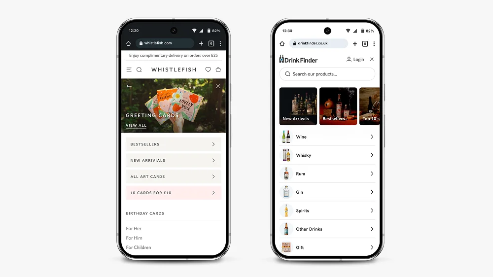
Whistlefish and Drink Finder have bespoke mobile-first menus. Both are tailored for their product offerings and their users’ needs. Allowing the client flexibility to upsell offers and create new collections.
Navigation is one of the most important design decisions on a Shopify store, and one of the areas where themes most consistently let brands down.
Most premium themes look fine in the demo, with clean placeholder content and a handful of tidy category labels. Add real store content — longer collection names, multiple sub-categories, a mix of product types — and many theme navigation systems completely fall apart. The layouts break, the hierarchy becomes unclear, and the mobile experience in particular deteriorates quickly. This is one of the most common things I see when I start working with a store that has outgrown its theme.
The question to ask is simple: can someone who has never visited your store before find what they are looking for in two clicks? For most stores, the answer is no.
Good Shopify navigation in 2026 means thinking about multiple entry points. Some customers will land on your homepage and browse. Others will arrive on a product page from a Google search. Others will come from a paid social ad to a specific collection. Every one of those journeys needs to make sense independently.
A few principles that hold up consistently:
Bring your most important collections out of the burger menu and into the navigation bar. A hidden menu adds friction for customers who know what they want. On mobile especially, expanding a menu to find a category is a barrier that costs clicks.
Use your navigation hierarchy to guide rather than overwhelm. Three to five top-level items with clear sub-pages is almost always better than a flat list of twelve collections.
Search is often neglected but is one of the highest-intent actions a customer can take on your store. If you have more than 50 products, a well-designed search experience with intelligent results and suggested products will meaningfully improve conversion. Themes give you a functional search box. Bespoke design lets you think properly about what happens when a customer uses it.
For homeware and lifestyle stores, alternative navigation routes — shopping by room, by trend, by occasion — serve browsers rather than just researchers. More on how this affects collection and landing pages is in my article on what makes a good landing page.
4. Homepage Design
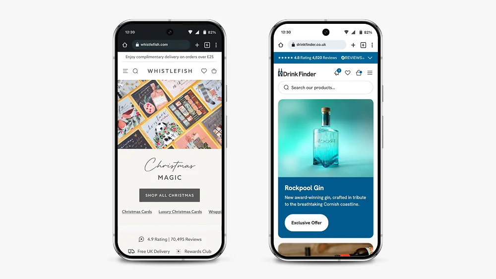
Whistlefish and Drink Finder homepages are fundamentally a series of collections. But the art is to bring in sub collections, trust drivers and brand messaging throughout. That is where hiring Shopify Expert pay comes into play.
Your homepage is not a sales page. It is a trust-builder and a navigation tool.
That distinction matters. Too many Shopify homepages try to do everything at once: announce a sale, feature every collection, showcase press mentions, display reviews, and tell the brand story, all above the fold. The result is noise, and noise increases bounce rate.
The homepage has one job: give visitors enough to feel confident, then point them in the right direction.
In practice, that usually means a clear hero section with a single message and a single action, followed by your main navigation into collections, followed by social proof at the right point in the journey. It does not mean cramming every trust signal and product category onto the page before the customer has had a chance to decide if they are in the right place.
One thing I flag consistently when reviewing stores: the homepage is not the place for long service descriptions or detailed product copy. Those belong on collection and product pages. The homepage should function as an entry point that earns trust and creates momentum.
This is also relevant from an SEO perspective. If your homepage and your collection or service pages are competing for the same keywords and content territory, they will work against each other. Your homepage should be differentiated by intent, not just topic.
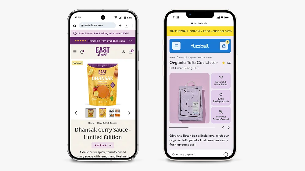
East at Home and Fuzzball product page. These bespoke product pages give the user key bits of information in the right place. Fuzzball example has key product USP’s high above the fold by creating a grid layout on mobile.
5. Product Page Design
Product pages are where conversion happens. If your homepage earns trust and your navigation creates momentum, your product pages need to close.
The fundamentals that consistently make a difference:
Hierarchy above the fold. On mobile, a customer should see the product image, product title, price, and a review score without needing to scroll. The add-to-cart button should be visible, ideally sticky on scroll. Everything else — the description, the specs, the shipping information — belongs below.
Benefits over features. Most product descriptions list what a product is rather than why someone should buy it. The difference matters. “100% merino wool” is a feature. “Stays warm without overheating, so you can wear it from morning to evening” is a benefit. For premium and lifestyle products, benefits-led copy commands higher prices and reduces hesitation.
Trust signals in the right places. Reviews, delivery information, and returns policies should appear close to the add-to-cart button. Not decoratively in the footer, not buried in an accordion. Customers have specific questions at the point of purchase and your page needs to answer them without making them go looking.
Thoughtful upselling. How related products are surfaced and how upsells are introduced depends entirely on your product type and how your customers think. A customer buying a consumable product thinks differently to someone buying a considered furniture purchase. A theme applies generic upsell logic regardless. Bespoke design maps this to your specific purchase journey, which is where the real gains in average order value come from.
The work I did on Zen Maitri’s product pages shows how hierarchy and trust signal placement translate directly into better performance. More detail on that, along with before and after screenshots, is in my conversion rate optimisation article.
6. Mobile-First Design
In 2026, designing for desktop first is not a mistake, it is a category error. More than 70% of Shopify traffic is mobile. Your store needs to be designed for a phone screen before anything else.
Mobile-first design is not the same as responsive design. Responsive design means a desktop layout that adapts to smaller screens. Mobile-first means starting with the constraints of a phone and working outward. The difference shows up in how navigation behaves, how product images scale, how much text appears before a scroll is required, and how buttons are sized and positioned.
A few things that separate genuinely mobile-first Shopify design from a desktop site that has been squeezed: sticky headers and add-to-cart buttons that do not obscure content; navigation that works with a thumb, not a cursor; images that load fast on mobile networks; collection pages where filtering does not require a full-screen takeover on every use.
I design in Figma at mobile size first, then scale up to desktop. This forces decisions that improve the experience across all devices rather than creating a desktop design and hoping it translates.
For more on how small design details affect the overall experience, my article on microinteractions in Shopify design covers the specific mechanics of why these details matter more than most people expect.
7. Editorial Sections and Landing Page Flexibility
This is an area that catches a lot of store owners off guard, and it is one of the places themes fall down most noticeably.
Most themes have limited editorial section templates, and many do not allow proper semantic heading structure — meaning you cannot control whether a section title renders as an H2, H3, or H4. That matters both for SEO and for building out the kind of content-rich landing pages that rank well and convert.
If you want to create campaign pages, seasonal landing pages, editorial content, or category pages that do more than list products, you quickly hit the ceiling of what most themes can do. The sections look fine in the demo but do not give you the flexibility to map out real content in a meaningful way.
In a bespoke build, every editorial component is designed intentionally. You know exactly what each section can contain, how headings are structured, and how content will render before a single line of code is written. This makes building out new landing pages straightforward rather than a workaround exercise.
For more on what goes into a well-structured Shopify landing page, see my article on what makes a good landing page.
8. Speed and Performance
A well-designed Shopify store that loads slowly will still underperform. A one-second delay in load time can reduce conversions by up to 20%.
Shopify handles a lot of performance optimisation at the platform level, but there are still decisions in the design and build process that affect speed significantly.
App overload is the most common culprit. Every app installed on a Shopify store adds code. Review your app list and remove anything you are not actively using. If you have three apps each doing a version of the same job, consolidate.
Image optimisation matters more than most people realise. Uncompressed images on product pages are one of the main reasons for slow load times on otherwise well-built stores. Use WebP format where possible and keep product images under 200KB without visible quality loss.
Theme code quality varies enormously. Run your store through Google’s PageSpeed Insights and Shopify’s own speed report regularly. If performance is consistently low despite clean images and a lean app stack, the theme code itself may be the issue.
9. When to Hire Someone Instead
A lot of store owners start designing their Shopify store themselves. That is completely reasonable, especially in the early stages. The problems usually start when they hit a wall — the theme will not do what they need, the navigation has broken under the weight of real content, the conversion rate is not improving despite changes, or they simply cannot get the store to look and feel the way they have in their head.
At that point, continuing to iterate without specialist help often costs more time and money than bringing someone in from the start would have.
There are a few specific situations where hiring a Shopify web designer is clearly the right call:
When you have outgrown your theme. If you are spending more time fighting the theme than building your store, it is time to think about a bespoke build. The signs are usually obvious: navigation that breaks with real content, editorial sections that will not do what you need, upsell and purchase journey logic that does not fit your product.
When you are in a competitive market. If your competitors have invested in good design and you have not, you are at a disadvantage that compounds over time. Customers make snap judgements. A store that looks generic next to a store that looks considered will almost always convert at a lower rate, regardless of product quality.
When your current store is not converting. If you are getting traffic but not sales, the answer is not more traffic, it is fixing the store. A designer with CRO experience will diagnose where people are dropping off and why, then make targeted changes rather than rebuilding things that are already working. My Shopify CRO service starts with an analytics review before touching anything.
When your brand needs to carry weight. For premium products, the store design is part of the product experience. If your price point requires trust and your store does not communicate that trust, you will underperform. This is particularly true for DTC brands where the store is the entire customer relationship.
When you have specific requirements. Subscription products, quiz flows, complex product variants, or custom purchase journeys require design thinking and platform knowledge that goes beyond what any theme can handle cleanly.
I work with brands across all of these situations. If you want to understand what that looks like in practice, my Shopify design services page covers how I approach projects, or you can browse the case studies directly.
Conclusion: What Good Shopify Design Actually Looks Like
Designing a Shopify website in 2026 means thinking clearly about strategy before touching a single section. It means making an honest decision about whether a theme or a bespoke build is right for where you are right now — and knowing that answer will likely change as your store grows. It means designing for mobile first, building product pages around the questions customers have at the point of purchase, and keeping performance front of mind throughout.
Good Shopify design should be invisible. When it works, customers do not notice the design. They just find what they need, feel confident, and buy. That is the goal.
If you have questions about your specific store or you are weighing up whether to design it yourself or bring someone in, take a look at my Shopify website design services or get in touch directly.
Related services: Shopify store design, Shopify store development and Shopify theme customization.
Keep reading

Shopify CRO Cost: What Experts Charge and What You Get
How Shopify CRO services are priced (audit, project, retainer), what affects the cost and what a fair proposal should include.
Read article →
European Accessibility Act for Shopify Stores: Checklist
What the European Accessibility Act means for Shopify stores selling in the EU, plus a practical accessibility checklist and testing tips.
Read article →
Shopify GDPR Cookie Consent: Setup Without Losing Data
How to set up GDPR cookie consent on Shopify for EU and UK visitors, keep analytics useful and test that tags respect consent.
Read article →Want more sales from your Shopify store?
I help US Shopify and Shopify Plus brands find what stops visitors from buying, and fix it.